Step 01
Start with a clear estimate
Every project begins with a straightforward conversation about the pool, the yard, and the outcome you want.
About
Licensed Pool Contractor
HydroTech Pools can be presented as a contractor that handles the big picture: new pool projects, remodels, ongoing care, equipment support, and outdoor upgrades that help the whole property feel finished.
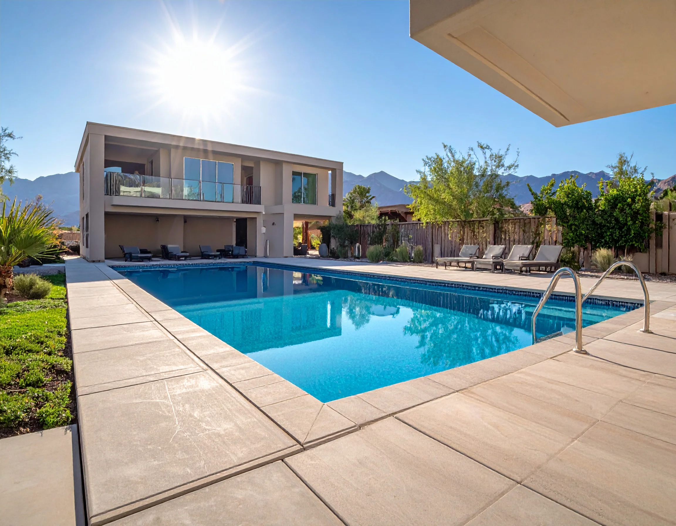
Morning service atmosphere
Approach
The strongest version of the brand feels polished without getting corporate: clear communication, strong finishes, and work that looks visibly cared for from the first glance.
Trust Signals
Step 01
Every project begins with a straightforward conversation about the pool, the yard, and the outcome you want.
Step 02
Construction, remodel, and repair work should feel organized, detail-focused, and visibly well cared for.
Step 03
Ongoing service should protect water quality, equipment performance, and the presentation of the pool over time.
Step 04
Good service feels responsive, dependable, and easy to schedule whether you need maintenance or a larger project.
Contact
Call for new construction, remodel planning, weekly maintenance, equipment support, or a free estimate on the next pool project.
LIC #1128032
Coverage